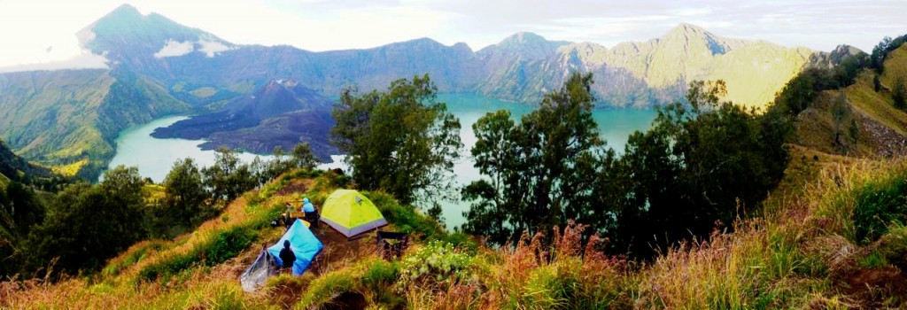
This summer, I’ve been traveling in Indonesia. A great occasion to fill my personal blog with plenty of pictures! Some are pretty awesome, like the following one of the rim of the spectacular Rinjani!


Sadly, other pictures are just so much less amazing than the actual sights I had the chance to see. In particular, while I was hiking all alone in the immense caldera surrounding Gunung Bromo, the clouds were running down the hills and surfing on the black sand of the desert I was in the middle of! Unbelievable! It’s such a shame that the pictures I took were nowhere near capturing the awesomeness of this unique moment… On the right is the best of them.
If only I had been equipped for high dynamic range (HDR) technology! I would have had a souvenir at the level of my memory… And I’d be much more able to share it with you! Fortunately, this technology is being inserted in more and more of our devices (I know it’s on the iPhone for instance). Let’s see how it works!
Eye versus Camera
First, let me make the point that cameras are quite far from capturing what our eyes actually see. Not only do the eyes have much higher quality sensors, but they also efficiently adapt to what they are faced with.
Yes! For instance, when you drive under a bright and sunny sky and you suddenly get into a tunnel, everything gets very dark. But, give it a couple of seconds, and you are able to see clearly once again. That’s thanks to the awesome capacity of adjustment of our eyes! And, as we’ll see later in this article, that’s only half of the story, as our brains then perform many more manipulations of our visions which enable us to quickly and efficiently scan through what we see!
But first things first, let’s listen to Griffin Hammond explaining the greater sensing capabilities of our eyes on Indy Mogul.
As Griffin says, high dynamic range can enable us to get closer to what our eyes see!
Hehe… First, I need to tell you about the physics of brightness. At the fundamental level, brightness corresponds to an amount of energy received on each sensor of the retina or of the camera. This amount of energy depends on many factors. Some are related to the nature of the light, such as the brightness of the source, its distance from us and the wavelengths. Others are properties of the sensor, like the size of the pupil or the aperture, the sensitivity of the light sensors, and the persistence of vision of the eye or the shutter speed of the camera.
For a full description of how cameras capture light energy and how this can be configured, check this awesome video by Carolina Molinari on Ted Education:
Rather than talking about f-stops (or simply stops), I’ll be talking about exposure value (EV), which has the opposite value to f-stops. This is more intuitive as a higher EV corresponds to a brighter image.
A picture will have one more EV than another if the captured light energy is twice that of the other picture. More generally, a $n$-EV difference corresponds to captured light energy being $2^n$ times greater. Or, equivalently, if you’re familiar with logarithms, the EV difference equals the base-2 logarithm of the ratio of captured light energies.
That’s because the variations of light energy are huge! For instance, 10 EV corresponds to $2^{10} \approx 1,000$ more light energy! That’s why a logarithmic scale is preferred. Such scales are also used to measure sound with decibels or concentrations of H+ ions in water with pH.
Yes! But to get there, I need to also introduce pixels. Digital pictures are actually gigantic grids of colored squares (which you can see if you zoom in in your pictures!). Each of these squares is called a pixel. It has a certain luminosity called lightness.
It’s nearly the same for eyes, even though the image seen might not be an actual grid. More precisely, the eyes are filled with sensors which are rod and cone cells. Each of theses cells produces the equivalent of a pixel. Overall, whether an image is a camera’s or the eyes’, it’s always made of a collection of pixels, each capturing a certain amount of light.
Their dynamic range! The dynamic range is the greatest EV difference that can appear between pixels of a single image. Lightness below (or above) this range are then indistinguishable between each other. This is the case, for instance, of the pixels of the clouds in my pictures above. They all appear all white, even though they didn’t really have the same brightness.
Yes! While cameras can only see about 12 EVs in a single shot, our eyes can observe 20 EVs at once! Can you believe that? This means that eyes can see simultaneously some dark pixel and a $2^{20} \approx 1$ million times brighter point! Meanwhile, cameras are lost as soon as one point is $2^{12} \approx 4,000$ times brighter than another in one single image. Check this explanation on SLRlounge:
The limits of my (cheap) camera are visible on the two picture I’ve taken. Let’s see how high dynamic range technology fixes that!
High Dynamic Range
The idea of high dynamic range is to take several times the same picture, but with different apertures and/or shutter speed and/or sensitivity, so that the obtained pictures cover the same dynamic range as our eyes would. The figure below presents a case where 4 pictures of different EVs are taken.

Unfortunately, I don’t have any HDR software on my computer, so I’ll have to use Wikipedia’s images. Here are 4 pictures taken at different exposure values.

They do! But our eyes capture all the brightnesses in one single image. The cool idea of HDR is that we can mimic the eyes’ ability by merging the 4 pictures into 1!
One way is described by the following figure.

For each exposure value of the eye’s dynamic range, we choose the picture which best displays this exposure value. This will enhance the details captured. Then, we contract all values into the dynamic range of the picture. Applied to the pictures above, this yields the following result:

Much better, isn’t it?
I know! To do even better, we need to do tone mapping. To understand this more advanced technic, let’s talk a bit more about lightness in pictures. This will also give you ways to greatly improve your not-HDR pictures, as I do with mine!
Histogram
The lightness of any pixel takes a value between 0 and 255 in most image formats, including BMP, GIF, PNG and JPG. The greater the lightness, the brighter the pixel. Now, if you take a picture, you can count the number of pixels of any given lightness. Plotting this number of pixels as a function of lightness then yields the histogram. Below is the histogram of the picture of the Rinjani, which I got from the software GIMP (but you can also find it on any image viewer).

As you can see, most of the pixels of my picture are either darker than the middle value 127, or extremely bright. This can be interpreted as the picture being underexposed for most pixels, but highly overexposed for some of them. Indeed, on the picture, except for the extremely bright sky, we have the lit cliffs which are finely exposed, while the rest of the picture is definitely too dark. That’s why we should add luminosity! This can be done with pretty much any image softwares, from iPhoto to Windows’ viewer.
Yes! Below is the image and its histogram when luminosity is added.

To better view the histogram, I have actually cut its top. Indeed, the number of pixels of maximal lightness is now overwhelming! Even though most of the picture is improved, some of it gets destroyed.
No, that’s not the eyes want to see! Indeed, getting the lightness close to the middle value is easily done by decreasing contrast.

Not that good, is it?
Decreasing contrast has contracted the lightness towards the middle value. Thus, all pixels have more or less the same lightness, which makes the picture kind of sad-looking. In particular, details of lightness are destroyed. On the opposite, increasing contrast would stretch the histogram, as illustrated below. This is great, as it enhances the details of the picture. But if you add too much contrast though, you destroy the extreme lightness.

When you get used to histograms, you can quickly detect key flaws of a picture by just looking at its histogram. In fact, today’s cameras can compute histograms of what they are about to capture. This is relevant information you can use, as explained in this other great video by Griffin Hammond on Indy Mogul!
Now, let me go even further! The more spread a histogram is, the more it exploits the full range of lightness to better illustrate what it displays. This should not be of any surprise to you if you’ve read my article on Shannon’s information theory! The case with maximum entropy would then be a histogram close to an equalized histogram, for which all lightness occur with the same frequency in the picture!

That’s obviously no theorem, but it’s a very nice rule of thumb! Except for pictures which clearly take advantage of a dominant darkness, or a dominant brightness, or a brilliant clair-obscur effect, most images get greatly improved by having their histogram equalized!
Unfortunately, in most cases, you can’t. Using luminosity and contrast only is in fact very limited. Fortunately, using GIMP (which is free!) or Photoshop, it’s not that hard to do much better, using global tone mapping.
Global Tone Mapping

Global tone mapping is a modification of the lightness of all the pixels of the image, depending only on their original lightness. In other words, two pixels which initially have the same lightness must still have same lightness after transformation.
Yes! And since a lightness takes values between 0 and 255, a tone mapping is thus a function from the set of integers between 0 and 255 into itself. In particular, like for any function, a curve describing a global tone mapping can be drawn, as is done in GIMP in the figure on the right.
With GIMP or Photoshop, what’s pretty cool is that we can choose any global tone mapping we want by modifying the curve manually! If you want your image to be realistic though, it’s definitely better to restrict ourselves to increasing functions. Indeed, if a pixel is initially brighter than another one, we can expect it to remain brighter after transformation. Otherwise, we’d end up with negative image such as the following one, where lightness is completely inverted.

Yes! For each parameterizing of contrast and luminosity, we are in fact defining a certain global tone mapping. Now, I don’t know exactly what these tone mappings are (it may depend on the software after all…), but it’s probably something like the following ones. The first one is an addition of luminosity, while the second is an increase of contrast.


Hummm… Because of the discrete nature of lightness in digital pictures, the perfectly equalizing global tone mapping rarely exist. But there are tone mappings which can get us quite close to the equalized histogram.

Yes!
You need to focus on the slope of the tone mapping curve. When this slope is steep, then the corresponding lightness in abscissa gets stretched. Thus, wherever there is a bump in the histogram, the slope should be steep. Conversely, wherever the histogram is very low, the slope of the curve should be nearly flat. This will contract the lightness with few corresponding pixels, providing more space for other lightnesses. This is what I’ve done to obtain the curve on the right!
This one…


Even when you use GIMP’s automatic histogram equalizer, when you look at the obtained histogram which is displayed on the right, you see holes… These correspond to the lack of information we have when we don’t use HDR!
I know!
No. That’s because there’s a much more awesome technic than global tone mapping, which is used by our brains! Let’s now talk about local tone mapping.

Local Tone Mapping
The idea of local tone mapping is that the lightness transformation should depend not only on the original lightness of the pixel, but also on the original lightness of its surrounding. Indeed, as our eyes scan a real landscapes, our brains have this fascinating capacity to see the details in all ranges of light. What in fact happens is that, for every small area of our sight, our brains perform an automatized contrast enhancement.
You don’t? How would you explain Edward Adelson’s optical illusion then? In the picture on the right, squares A and B have the exact same brightness!
And if you’re still not convinced, I’d invite you to check Beau Lotto’s Ted-Talk on optical illusions!
It makes sense, doesn’t it?
One way is to separate the pictures in different sections, each of which will be given its own global tone mapping. This technic is also known as exposure fusion, and is the one presented below, still by Griffin Hammond, on Indy Mogul. In this extract, he also presents an automatized way to identify the different sections of the exposure fusion. Namely, they are defined by the extreme luminosity of the brighter picture.
However, the eyes don’t only separate images in only two or three areas. They perform local contrast enhancement on all small areas of the vision angle!
One way is based on comparing the brightness of each point with the average brightness of its surrounding. Consider a pixel corresponding to a galaxy far far away. It’s only going to be slightly brighter than its surrounding, and this detail will be unnoticeable without local tone mapping. Now, in a simplified model, you can add to its brightness the difference between its original brightness and the average of the original brightnesses of its 8 neighbor pixels. This is what’s done below:

The detail of the brighter middle pixel was not obvious for the camera, as the lightnesses were all very close. But our eyes would have been able to detect that in a real sight! The operation described above increases the difference between the middle pixel and its surrounding by making it darker (while the others would have got brighter). As a result, it mimics our eyes and makes the image closer to what our eyes actually see!
On the wikipedia’s picture I used above, using similar technics yields the following spectacular result:

Notice how small details are now really appearing!
Yes it can! For instance, iPhoto provides a parameter called definition which increases contrast locally. However, the limits of cameras imply that the measures of lightness of badly exposed pixels are subject to small errors. In other words, the fact that the middle pixel in the figure above is brighter than others might be due to a bad lightness measure. By increasing contrast locally, it may thus magnify the error, hence creating a detail which does not exist in reality! That’s why it’s essential to have pictures with the right exposure for all lightnesses to perform relevant local tone mapping!
Exactly! Only such a combination can get you pictures nearly as awesome as what our eyes see!
Let’s Conclude
Two things particularly fascinate me about HDR and tone mapping. First is how the obtained pictures look similar to drawings. Amusingly, a lot of people consider them less realistic because of that. However, it rather seems to me that we have actually been used to the pictures our cameras have been able to take so far. And I believe it to be the reason why we consider such pictures more realistic. Yet, I doubt painters have been trying all along to paint unrealistic images. Rather, I guess they have been naturally led to use local tone mapping to make their images realistic!
The other thing is just how brilliant our eyes are! It’s amazing that we can see as well as we do. The technology of our eyes is so far above the technology of our cameras! So here’s one thing I want you to do as soon as you’re done with this article. Go to your window or get on the street. Close your eyes. Open them and focus on all the details of your vision. Think about the billions of years of evolution during which organisms have lived and died to perfect the technology of your eyes and brain. And savor!
Now, whisper a huge thank you to your eyes and your brain for the gifts they keep bringing you every single 25th of a second…
Leave a Reply